eoghan posted on February 01, 2008 15:53
 For years people have been talking about the day when we'd be able to access the internet on our mobile phones. The first technology that had a stab of bringing the web to a mobile phone was WAP ('Wireless Application Protocol'). It raised its clumsy head in 2000 or so and was - to be polite - an excruciating experience for users. In any case only a tiny number of sites (bless 'em) went to the trouble of providing a WAP enabled version of their website.
"Fret not", we thought back then, "glorious pocket-based browsing is surely just around the corner now that the telcos have splurged all these countless billions on 3G licences". Well it never really worked that way, did it? 3G is with us and a 3G-enabled phone is indeed quite likely sitting in your pocket right now. And how was the experience the last time you used it to browse the web? If your visit was to one of those mobile portals such as Vodafone Live (which have limited range of content on offer) the experience could be logged as something approaching 'tolerable'. Stepping out of the clutches of such a phone company's portal often gets very unpleasant, very quickly. One way out is to type in a web address on the phone but the less said about the complexities of doing so on many mobile phones, the better. The more usual route from a mobile phone to more interesting edges of the web is to run a simple a search on a search engine but, invariably, you end up quickly hitting some pretty ugly web pages that try to squeeze themselves into the tiny space on your phone’s screen (and any site that does look okay it is only because they have gone to the considerable lengths of creating a mobile compatible version of their website, something that is beyond the financial, time and technical resources of most webmasters, myself included).
Boiling it down to its essential: browsing the internet with your mobile sucks. But that all changed recently with the arrival of Apple’s iPhone.
Thanks to the iPhone the 'internet-in-your-pocket' (well, a 13cm x 7cm pocket) is - at last - becoming a reality. With one glorious step Apple managed to do what so many previously could not: they managed to suss the 'how to get a website looking as decent on a mobile phone as it does on a computer' conundrum thanks to some very elegant and imaginative flourishes when it comes to the user interface and web navigation.
Much of the press has been (quite rightly) falling over itself singing the praises of these advances for users. But for me the real stroke of genius with the iPhone is not how it benefits users but how it benefits website owners: if your site’s design is smart and adheres to some well established best HTML practices you won’t have to create a second parallel version of your site for it to be accessible on the iPhone. Touché – all of a sudden the mobile web can now encompass, in very real terms, a significant proportion of the most interesting websites out there.
So how does the Apple iPhone do this? Here’s the quick answer. When you visit a website with your iPhone it downloads the page, as you’d expect. The browser built into the iPhone (Safari) then works out what the page would look like on a PC browser that is 980 pixels across. It then scales down the page as it would look on such a PC so that it fits into the iPhone screen. For most sites this means the iPhone user can then see the full webpage on their phone in one glance. The downside however is that for many sites some individual words will be difficult to read (as they will be too small after the page has been ‘shrunk’ down to fit on the iPhone screen). Apple have, of course, got this covered: all the iPhone user needs to do is just ‘double tap’ on different parts of the page and - if the web page adheres to established standards and best practices - the iPhone will zoom in and the user can now easily read the text / see the images on that part of the page.
While Apple is leading the way with these innovations, it’ll only be a matter of time before they inspire other handheld manufacturers to deliver a whole range of mobile devices that will, in similar, ways make it straightforward for the non-Apple masses to browse the web while on the move. I think it is finally safe to safe that the mobile internet is going to happen. Big time.
Those who run websites or blogs would do well to ensure their sites are ready for this iPhone-inspired era that is on its way. A few questions that any conscientious webmasters should be asking themselves...
- How does your site look on an iPhone?
- Does it adhere to established best practices? For example if you want the 'double tap' interaction described above to work you need to divide your web page's text into meaningful blocks using the 'div' tag.
- Is the full payload of your webpage reasonable or is it still going to take an age to download? Download times really matter on the mobile web, make no assumptions about your users' patience. Or the data limits set by their telephone company.
- Do you have content of your site embedded in a Flash file? Careful as the iPhone does not load Flash based websites.
With all this in mind I last month started to look into what it could all mean for CLUAS. While the CLUAS.com traffic stats showed that only 24 people visited CLUAS using an iPhone in the last 2 months of 2007 I knew that this figure could grow hugely in the future as the numbers of iPhones (and iPhone inspired handhelds) in circulation increases, but only if CLUAS has tweaked things to make it better for such visitors.
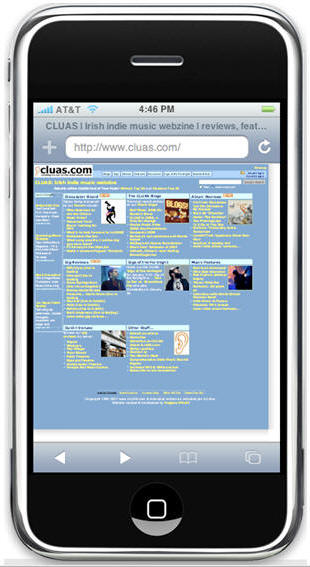
So in early January I focused my efforts, as a first step, on revamping the HTML code behind the most important page on CLUAS – the website’s home page. The result of this effort is that the CLUAS home page now not only loads perfectly in an iPhone but a 'double tap' on an iPhone screen will work as it should. There are other positive consequences of the change. For example this conversion meant that the HTML file of our home page was reduced about 25% in size (from a previously modest 20 KB down to a super slim 15KB). The content of the page is also better structured - logically and semantically - which means that search engines can more easily understand what our content is about and determine the relative importance of all text and links on the page (all the better for our permanent goal of getting CLUAS content to rank better and more widely).
I don't expect this to result in a massive increase in traffic to CLUAS from iPhones. However when mobile browsing à la iPhone takes off CLUAS aims to be well placed to capture a decent part of the action.
Do you you have a website or a blog? If so you too should look into its readiness for the sophisticated mobile web of the coming years. Excuse a brief descent into some technical details but here's a few quick concrete checks any webmaster serious about having an iPhone ready website needs to do:
- First up the obvious one: visit your website on an iPhone if you have access to one and see how it looks.
- If you don't have an iPhone but you own a Mac, no problem, you can test it using the iPhoney application (which partly emulates the browser function of an iPhone, but it can only be installed on Mac computers).
- If you have a Windows computer my advice would be to:
- Download and install the Safari browser for Windows
- Open up the Safari browser, visit this page which if you follow the instructions below will allow you to see how your website would look on an iPhone. On the page you just need to:
- Enter your site's URL (i.e. web address),
- then enter '980' for 'width' (i.e. this corresponds to the number of horizontal pixels the iPhone uses when it initally presents a web page),
- in the 'height' box enter something like 700 or so,
- Then click 'Test'.
- This will then resize your browser to 980 pixels across and load up your site. What you see is how you can expect your site to look on the iPhone (i.e. 980 pixels across).
- Once you have seen how your site will look on an iPhone you may see changes you need to make in terms of its layout. Keep in mind:
- Your site should not have key content embedded in Flash files, the iPhone will simply not be able to access such content. Same goes for Java applets (but Javascript is supported).
- You should structure your web page's content in line with established best practices for laying out and structuring text on web pages (e.g. avoid HTML tables, instead use div tags to create blocks of content, lay it out using CSS styling and then structure the text using tags such (h1, h2, h3 tags for headings, p tags for main bodies of content and li tags for lists).
- Check the size in KBs of the main page of your website using a web page analyser service. Ideally the main page of your site (its HTML + images + style sheets + Javascripts) should weigh less than 150 KBs. Anything more than that may easily test the patience of your visitor (especially important for new visitors, first impressions count, and all that).
These are only a few of the most basic guidelines. Those looking for more detailed guidance should go to the horse's mouth: Apple have put together an extenisve 'Designing Content' chapter in their iPhone Developer Centre.
Okay, time to wrap this up. The mobile web is going to explode. Not in the next month, not even in the next 6 months. But 2-3 years from now the web will be a radically different place and huge numbers of people will access it in ways - and with a frequency - that they do not do so now. If you have a website or a blog the time to get ready for this is not next year but now.
CLUAS is far from being where it needs to get to, but we are getting there. Want to join us?
More ...
[Read More...]